Google changed the iGoogle Gmail gadget to make it look more like their mobile interface, which is better than the pop out window they had been using, in many ways...the only practical issue I have, is that it would be a lot more useful if iGoogle itself had user-scalable columns instead of the fixed, predetermined columns.
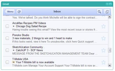 |
| The inbox enlarges texts for readability. |
 |
| Emails use the frame within the gadget, instead of popping out of the gadget. |
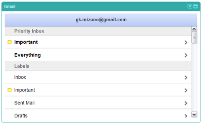 |
| Easy to simply scroll down and find the labels - even custom ones - to find emails. |


No comments:
Post a Comment